
For the hard copy index cards that provide a portable copy of the information pertaining to a specimen - and which can accompany a specimen when in storage, I use two fonts - Sanford for headings and titles and a distressed typewriter font for the details. This gives the card something of an old world look and nicely defines form data and specimen information.
At the moment, my labels are still designed using either Arial or Times New Roman which, though eminently readable, are somewhat dull and unprepossessing. It is time, I thought, for a new set of labels (that aren't yellowing with age) and that look more dignified than mass produced.
Now, my eyesight isn't what it used to be, so my ideal font needs to be clear and unambiguous. I also want the labels to have a handwritten appearance, without the strange effects that my poor handwriting imposes. Enter - The Font Library - well, a number of font download sites at least.
Searching on the terms cursive, hand written, script, calligraphy etc. yields tens of thousands of fonts to choose from. So, off I go - looking at the samples (25 per page, over 700 pages). Oh dear!
Many fonts are designed to look like they have been written using heavy markers. Excellent, but not what I want. Others emulate children's writing (I think one of my essays when I was aged 5 may have been used for one of them - unreadable).
 There are beautifully calligraphed fonts - many are highly decorated, and not suitable for the job.
Many others are, well, here is my first complaint.
- Calligraphed fonts are often created for technical accuracy and not readability. They are like trying to read a row of planks with the perfectly parallel uprights and tight spacing.
The aesthetic I am trying to achieve requires a more rounded hand than calligraphy provides. Moreover, I dislike printed hand text (where each letter is isolated from its neighbours), so I want something closer to cursive complete with ligatures.
And now we are into the wonderful world of script fonts. Ignoring the artificial-looking fonts that emulate newspaper advertisements from days of yore, we have a choice:
Handwritten fonts, designed to emulate handwriting, are (apparently) what I want.
But - and here comes my next group of complaints.
- Handwritten fonts often have over large ascenders and descenders, rendering the font unreadable at normal font sizes. (right: Cherryball)
- Handwritten fonts often seem to use descenders on letters that are without descenders (leading to the letters l (L) and t being mistaken for f or j ).
- Handwritten fonts use, almost invariably, the cursive forms of the letters r and s, which renders them ambiguous to read in a line of text.
- Handwritten fonts, no matter how well designed, tend to emulate real handwriting in their indistinct letter forms, rendering them just as unreadable as real handwriting.
- Handwritten fonts frequently have stylised capitals that are ambiguous in form, and lead to misreads as often as not.

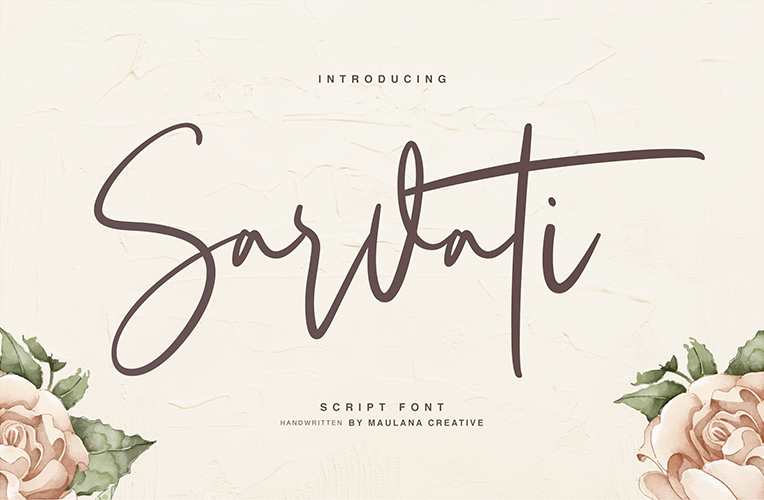
The result is that many fonts are so ambiguous that the name of the font is unreadable when presented in that font - even knowing what the font's name is. (That's Sarvati, on the left)
(That's Olean, by the way)
What I am looking for is a font which has unambiguous characters, well proportioned ascenders and descenders, an open form (but not too open) and the look of having been written by a professional letterist.
Last, but not least, it needs to be a full font with accented characters. So many fonts on line lack any accents.
The quest continues .
I'll let you know if I ever find my perfect font ....
Update:
After reviewing about 14,000 fonts, the least undesirable turns out to be -
It is, at least, readable down to 10pt, and doesn't look like it has been formulated by a chicken scratching in the dust (my writing is exactly like that - the chicken, I mean).